Tuesday 17 December 2013
finial ident justification.
we have decided to chosen to do this ident as we feel it is the best and represents channels 4 corporate identity very well. we have focused on developing our idea on further to improve and also be as appealing to the audience as we can possibly make it. we also felt that this links in with many of channels 4 other idents and is all merged into one making it more exciting and interesting to watch. we can make many more different idents like this as there are various types of locations in the world that are very different making it very appealing.
Thursday 28 November 2013
18& 30. client review
CLIENT MEETING
RECORD SHEET
|
Date: 26/11/13 Time: 2:00pm Place: Ravens wood School
|
Present: Miss K Moore, Mr C Wheelhouse, Miss O
Griffiths, Mr H Holland, Mr L Biley and Mr J Peagam
|
Items
Discussed:
|
WWW;
·
Our story board was clear and the audience liked our
idea
·
We explained our concept of the idea well
·
We explained how we came up with the idea through
our research and various surveys
·
We said what would happen in our ident clearly and
with good explanation we got our idea across to the audience.
EBI
·
We didn’t mention what age we would aim our ident
at.
·
We didn’t include a series of ideas in the
presentation to show how our idea will be an ongoing concept.
|
21.Revised Proposal + planning.
Concept or idea
My advert is very simple but also very effective. A spark is lit, we then follow the spark through different landscapes such as a Forest, City scape, and then finishes going trough a beach. The spark then goes up a volcano and stops half way up. The volcano then Erupts, the lava explodes and falls down the side of the volcano. The lava is then shaped into the number '4'.
There will be different types off noises for the different locations we have chosen. For example the forest there will be noises such as birds and wind in the trees, for the city scape there will be people talking and car horns going off, then for the beach will be the waves braking and finally our last noise will be a bang for the volcano erupting. Our animation will be of the spark as i will be in a cartoon format.
Purpose
The advert we have designed I feel will catch the audiences attention but also will be very relaxing throughout. when the volcano erupts it will be exciting and different making the audience excited and interested, ready for the program that is going to be played.
We have chosen various location as we feel that they are very different to each other and very unique. Each location has it own personality, their own special features that defines and show them apart. Many things are linked and different in the world. The locations we have chosen all have different elements that go on within them.
Key Context.
Our advert will be around approximately 15-20 seconds.
We will have many different locations throughout our ident. places such as a Forest, city scape, beach and a volcano.
Our main 'character' is our animation of our spark that is shown throughout 90% of the advert.
Our camera will follow the spark through the different locations we have chosen.
There will be different sounds for our different location. forest; birds and animal noises. City scape; car noises and horns. beach: waves braking. volcano; big bang.
Target audience.
My advert will appeal to the ages of people from 14-40. this means that my advert with appeal to very young people as well as older people catching the eye and entertaining viewers of all ages.
the genre of my advert is a bit of comedy with a Genre called 'slice of life'.
Our age target is around 14-40 year olds.
Our advert is aimed at both Male and Female.
I feel that this idea will be successful because it is different. It uses the concepts of other Channel 4 idents. takes there ideas and puts it all into 1. This idea is unusual and unique is has many different stages and ideas instead of using them separately we have put them together, condensed them down and made a different type of advert which can be changed into loads of different adverts in the future.
Conventions.
I feel this advert will catch the eye of many viewers, it is different to others, and I have taken past questionnaires and used people of the public to get feedback to make my advert the best it can be. However I have still kept the main concept of previous channel 4 adverts and have put it into my ideas and also put my own spin on it.
I feel that my advert is very creative. there are many different things going on that all link with each other. There is also animation which I feel fits it with real life scenes very well. it is a quick and catchy advert making sure the viewer doesn't get bored throughout.
Rebranding Case Study
Itv Idents.
Itv idents are things of everyday life. They have used things that people do daily and recorded certain parts and then added their logo into the left hand side of the screen while there ident is still playing. However they don't pick the boring people. They pick things that are exciting and things most people can relate to, bringing people memories back.
The ITV new logo is very impressive it is lower case. however there is no colour scheme. It blends in with the colour of either what program they are presenting or what colours are in there idents. They have made the shapes within the 'ITV' very well. They had produced them so when the colours are changed to fit in with the background the shapes still make it very clear and easy to read.
ITV have done this rebranding to connect better with their viewers, they want to make their relationship better and stronger. This will hopefully make itv have more viewers and be more appealing to the audience.
ITV website has all their different logo's, and also has an example on how it works. It has a new ident with the logo changing colour due to the colours in the background. They have briefly described why they have changed it and also what they feel will happen due to the fact they have changed it. They have also have a short explanation of what they have changed.
I feel that the rebrand of their logo is very successful. Its a different idea but has very positive feedback. It is enjoyable to look at as it isn't all the same, it wont get boring as the colour change. Also I feel it advertises the channels a lot better. It fits in well and makes it look like its all one, the logo fits in well and doesn't look as though it Is out of place.
E4 New Ident.
E4 new idents are different to their old ones. Their old idents had a lot of random animation. They have kept the 'random' parts however they have put that random element into every life situation. They have taken parts of the way people live and put a twist into it they make it funnier and more interesting, showing the viewers what they want to see.They have designed Effer like a human. he has the same logo but with arms, legs, eyes and a mouth. Even though he has got a mouth he doesn't speak. He holds a board and the information is written on the board. They use Effer like a normal human. He stands doing normal activities, however he is placed so the viewer can clearly see him.
E4 have decided to to bring back Efer since he was in his last ident in 2003. He is cheaper to use and produce idents with him. They also feel that it will be a good change to there idents and will make it more interesting and un expected.
E4 have got Efer on there website as a whole different link he has a large picture with a billboard that shows hes going back, however showing his personality but making him sound real ' weather you like it or not' meaning hes coming back and if you don't like him then tough. Its trying to make him sound real and large.
I feel that Effer isn't the best creations however the way he is used and the idents he is in are different and exciting to others i have watch. Your not sure what is going to be next, he plays a normal human roll which gives him more effect, he's amusing to watch and interesting as he's acting normal.
Channel Logo Analysis:
E4 logo:
Target audience: I feel that this logo is aimed at a target audience of 12-28 year old. I have come to this conclusion due to the colour E4 have chosen and also the rounded shape can be a younger target audience however the sharpness of the 'E' is more aimed at a older age.
Channel 4 logo:

The channel 4 logo doesn't have a colour scheme, other the years they have changed the colour of their logo. However the way the different shapes form the number '4' makes this logo very different. Its confusing but very clever. Also this logo stands out and you can clearly see what it is.
Target audience: I have decided that the target audience is aimed at a more older generation. people from around 25-40 years of age i have chosen this target audience as there isn't a colour scheme and the shapes used can be quiet interesting.
BBC One logo:
The BBC One logo normally has a red background and a white font. this is a very good and clever technique the red is bright and vibrant. It stands put. The white however also is very clear on a red surface. the 'BBC' Is in blocks this makes it stand out more. The 'one' is also larger than the 'BBC' but isn't in blocks. This is clever because as it is bigger you see it more. but a the 'BBC' is In blocks it catches the attention of the viewer more.
Target Audience: Having looked at BBC 1 logo i have decided that there logo is aimed at a older age group this is due to the fact in font choice and how it is positioned in the middle of a square red background.
ITV logo:
Target Audience: I feel that this ITV logo is aimed at all ages, the colours can catch the attention of older people and younger. Also the way the font has been chosen will connect with a younger generation as it is lowercase and joined together.
SKY 1 logo:

Target Audience: I feel that this target audience is aimed at higher age. This is due to the colours that are chosen and also the format in which this logo is laid out. It is very bold and clear however there are simple shapes.


Monday 18 November 2013

Wednesday 13 November 2013
6. Research Proposal
Research Proposal
From: Tom Madkins and Kieran Mcwilliam
Date: 5/12/14
Subject: Research Proposal.
Date: 5/12/14
Subject: Research Proposal.
Proposed Research Topic:
The reasons behind idents on television is because they are designed to give some sort of announcement as to what channel the viewer is watching. there are many types of indents however they are all related to the channel and the channels previous idents. Within channel indents the logo of the channel appears at the end, however while this is happening there can be a voice over before a program starts to either tell the viewer what is going to be broadcast-ed but also what may be on later on the same channel. indents are a visual stimulation so the viewer can identify what the narrator is talking about. The design of an ident can affect what sort of audience it is attracting. To what extent does the design impact on the target audience?
Purposes
The target audience for channel 4 is between the ages of 18-30 year old. I have found this information out through Google. I also researched what type of people would watch Channel 4 and also what genre of programs they broadcast that will be aimed at the target audience of 18-30 year old. I have created several surveys to hand out to people to get more information. These surveys will be aimed at channel 4 viewers asking them what they feel about channel 4 and if they would make any changes, if so why would they. The surveys will also help me understand why these people watch channel 4 and if the target audience could possibly expand.
Background
My purpose for my channel 4 ident is to make sure the viewers are getting what they want. I will collaborate all the information together and give the current viewers what they want to see within the ident. However I also will use this information to try and expand the target audience either making it appeal to older or younger people.
My purpose for my channel 4 ident is to make sure the viewers are getting what they want. I will collaborate all the information together and give the current viewers what they want to see within the ident. However I also will use this information to try and expand the target audience either making it appeal to older or younger people.
[
Scope:
I will be spending many week trying to find different participants to help me gather what I need for this project, this will take roughly 3-4 weeks. I will then construct my crew and we will begin to create our ident. The reason for taking 3-4 weeks is that we want to gather enough information to be able to perform the best outcome. I will include many different people to gather my research. I will send my surveys out to 20 different people from various ages and genders. I will interview around 15-20 individuals at various different times over the 3 weeks. I will also conduct several focus groups with 5 different groups.
I will be spending many week trying to find different participants to help me gather what I need for this project, this will take roughly 3-4 weeks. I will then construct my crew and we will begin to create our ident. The reason for taking 3-4 weeks is that we want to gather enough information to be able to perform the best outcome. I will include many different people to gather my research. I will send my surveys out to 20 different people from various ages and genders. I will interview around 15-20 individuals at various different times over the 3 weeks. I will also conduct several focus groups with 5 different groups.
Method:
For the research of this process I have looked at many different things such as channels, surveys and conducted many interviews. All the research I have collected over the past 3-4 weeks will help me produce the best outcome for my ident. I have collected great knowledge of channel 4 idents researching the past and present indents to make sure I understand what the theme is. I have also looked as , how various idents are made, how they are edited and also why they are what they are, what indents are used when and why due to target audience. Collecting this knowledge together will allow me to make my ident very professional. I will be using professional camera and software. All sound and editing will be added in after making it more appealing to my target audience as I want to achieve channel 4 to have more viewers. i will go through many different stages to gather all my reasearch i need. For my surveys i will create them on survey monkey and then email them out to 20 different individuals. I ill them collaberate this information and put them into pie charts so i can cleaerly see the information. With my interviwes they will take place in Ravens wood School in a private office. I will ask the people im interviewing all the same questions. These interviews will take place for around 30 minutes each. with my focus groups i will conduct 5 of them. for each group they will be all the same age but different gender. these will all take place in the classroom. 4 of my focus groups i will ask them all the same questions and gather the feedback for each one. For my last focus group it will be a mixed age and i will use the information i have previously gathered to ask the questions.
Time Table:
Prepare proposal by: 26/6/2014
Complete literature review: 20/6/2014
Complete fieldwork by: 24/6/2014
Complete analysis by: 27/6/2014
Give presentation on: 29/6/2014
Complete final report by: 2/7/2014
Limitations:
The limitation i will have throughout this process will be if people decide not to fill in the surveys and not giving me the feedback. iIterviews can be limited due to the time allocated however for each interview i will give 30 minutes to conduct it. Within the focus groups if it is the younger age they may not take it as serious giving innapropriate feedback.
[
7. Rebranding Case Study
Itv Idents.
Itv idents are things of everyday life. they have used things that people do daily and recorded certain parts and then added their logo into the left hand side of the screen while there ident is still playing. However they don't pick the boring people. they pick things that are exciting and things most people can relate to, bringing people memories back.
the ITV new logo is very impressive it is lower case. however there is no colour scheme. it blends in with the colour of either what program they are presenting or what colours are in there idents. they have made the shapes within the 'itv' very well. they had produced them so when the colours are changed to fit in with the background the shapes still make it very clear and easy to read.
ITV have done this rebranding to connect better with their viewers, they want to make their relationship better and stronger. this will hopefully make itv have more viewers and more appealing.
ITV website has all their different logo, and also has an example on how it works. it has a new ident with the logo changing colour due to the colours in the background. they have briefly described why they have changed it and what they feel will happen due to the fact they have changed it. They have also had a short explanation of what they have changed.
I feel that the rebrand is very good. is it different, it is enjoyable to look at as it isn't all the same, it wont get boring as the colour change. also I feel it advertises the channels a lot better. it fit in well and makes it look like its all one, the logo fits in well and doesn't look as though it Is out of place.
E4 New Ident.
E4 new idents are different to their old ones. their old idents had a lot of random animation. they have kept the 'random' parts however they have put that random element into every life situation. thy have taken parts of the way people live and put a twist into it they make it funnier and more interesting, showing the viewers what they want to see.They have designed Effer like a human. he has the same logo but with arms, legs, eyes and a mouth. even though he has got a mouth he doesn't speak. He holds a board and the information is written on the board. they use Effer like a normal human. he stands doing normal activities, however he is placed s you can clearly see him.
E4 have decided to to bring back Efer sinc he was in his last ident in 2003. he is cheaper to use and produce idents with him. they also feel that it will be a good change to there idents and will make it more interesting and un expected.
E4 have got Efer on there website as a whole different link he has a large picture with a billboard that shows hes going back, however showing his personality but making him sound real ' weather you like it or not' meaning hes coming back and if you don't like him then tough. its trying to make him sound real and large.
I feel that efer isn't the best creations however the way he is used and the idents he is in are different and exciting t watch. your not sure what is going to be next, he plays a normal human roll which gives him more effect, he's amusing to watch and interesting as he's acting normal.
Friday 25 October 2013


Monday 21 October 2013
Cinematography
180 degree rule
Busted Year 3000
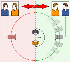
The 180 degree rule is where there is a camera that only turns 180 degrees. This camera can only see what is in front of the camera. Whatever is behinds cannot be seen, this can be useful due to the camera crew sound crew and other roles are behind the camera. these can all do their jobs normally close to the where the scene is being based and not worry about getting in the way of the camera. the camera moves and can only see what is in front from a 180 degree angle.
 Rule Of Thirds
In the rule of thirds, photos are divided into thirds with two imaginary lines vertically and two lines horizontally making three columns, three rows, and nine sections in the images. Important compositional elements and leading lines are placed on or near the imaginary lines and where the lines intersect.
However there is another method, 'rule of thirds' this is very good and useful for getting two different faces on one screen. one of the actors face is on one side on the screen, they pull the facial expression as if the person they are talking to is next to them, however on another camera the face of the other person is on the opposite side of the screen and they do the same expression.
Busted Year 3000
In film making, the 180-degree rule is a basic guideline regarding the on-screen spatial relationship between a character and another character or object within a scene. An imaginary line called the axisconnects the characters, and by keeping the camera on one side of this axis for every shot in the scene, the first character is always frame right of the second character, who is then always frame left of the first. The camera passing over the axis is called jumping the line or crossing the line; breaking the 180-degree rule by shooting on all sides is known as shooting in the round.

The 180 degree rule is where there is a camera that only turns 180 degrees. This camera can only see what is in front of the camera. Whatever is behinds cannot be seen, this can be useful due to the camera crew sound crew and other roles are behind the camera. these can all do their jobs normally close to the where the scene is being based and not worry about getting in the way of the camera. the camera moves and can only see what is in front from a 180 degree angle.
In the rule of thirds, photos are divided into thirds with two imaginary lines vertically and two lines horizontally making three columns, three rows, and nine sections in the images. Important compositional elements and leading lines are placed on or near the imaginary lines and where the lines intersect.
However there is another method, 'rule of thirds' this is very good and useful for getting two different faces on one screen. one of the actors face is on one side on the screen, they pull the facial expression as if the person they are talking to is next to them, however on another camera the face of the other person is on the opposite side of the screen and they do the same expression.


Saturday 19 October 2013
single camera Analysis
Single Camera Analysis.
Many different TV programs music's videos are all recorded by a single camera, this is due to many different things such as it being cheaper. also this methods id used because It makes it easier to focus on a main point. having a single camera makes it easier to record there's only one point of view that is seen. This is a simple and basic way of using a camera, however it is very effective and quick.
friends has a single camera. I feel that is used very effectively, the camera is aimed on the actors speaking, as this is more of a 'comedy' program its gives the lines the actors say and the way they act more effect as the camera isn't moving and changing views making it difficult and hard to follow/understand.
Friday 18 October 2013
Music Video recipe
This music video was released in 1986. It is called 'Bananarama' by venus. The music video was mainly of the artist, but dressed to the style of the 80's. the camera also sometimes went off the and did other mini clips of dark deathly things. this expresses what the lyrics are about and the personality of the artist and the song. it exploded with flames and dancing, this is because there wasn't many special effects so they had to doing it first hand. Giving the video more impact and making it more exciting.
This music video was created in 1997. This is called 'Virtual Insanity' sung by Jamiroquai. The music video had one main camera. That occassinaly pointed up and down. Giving the video more effect and able to change the scene clevery and efficiently. The video was mainly based in a small white room with the main artist singing and dancing in dark clothes so he stood out. The white room makes the artist look rich and big, white is a bright colour, with the main artist in in dark clothes bring him out making him bold. showing he's the main character, everybody should be looking at him.
Blink-182 created 'All The Small Things' music video in 2000. The video was based in several different places, going from scene to scene the group did something different. They danced and played there instruments to show the talent they had. The camera gave the video more effect and it moved around in the flow. This music video zoomed in and out to give it more effect, it shows the close up of the faces as well as the zoomed out camera shots. This is to exaggerate what they are wearing and also how they dance and move.
if the music and zoomed in and out. WHY??
Many things are found in various different music genres. many videos have lots of dancing. Many videos have different lighting to get different effects for the different type of song. The clothes varies to what genera it is. However Female artists give a lot of sex appeal, the attract men to watch there video from their dancers and what they are wearing.
GRADING
Working towards a Pass
The next step is to be more detailed in the way that you use your examples. Be specific.
Tuesday 15 October 2013
Sunday 6 October 2013
8.channel logo analysis
E4 logo:
 This is the e4 logo there colour scheme is purple. this colour stand out to theirs its not to feminine and not to masculine, they have always used this colour. they have also combined the 'e' into the '4' this gives the logo more imaginative look, makes it more exciting for the viewers. I feel this logo is designed well as you can clearly see what it is and also catches your attention.
Target audience: i feel that this logo is aimed at a target audience of 12-28 year old. i have come to this conclusion due to the colour E4 have chosen and also the rounded shape can be a younger target audience however the sharpness of the 'E' is more aimed at a older age.
Channel 4 logo:
The channel 4 logo doesn't have a colour scheme, other the years they have changed the colour of their logo. however the way the different shapes form the number '4' makes this logo very different.its confusing but very clever. also this logo stands out you can clearly see what it is.
Target audience: I have decided that the target audience is aimed at a more older generation. people from around 25-40 years of age i have chosen this target audience as there isn't a colour scheme and the shapes used can be quiet interesting.
BBC One logo:
The BBC One logo normally has a red background and a white font. this is a very good and clever technique the red is bright and vibrant. it stands put. the white however also is very clear on a red surface. the 'bbc' Is in blocks this makes it stand out more. the 'one' is also larger than the 'bbc' but isn't in blocks. this is clever because as it is bigger you see it more. but a the 'bbc' is In blocks it catches the attention of the viewer more.
Target Audience: Having looked at BBC 1 logo i have decided that there logo is aimed at a older age group this is due to the fact in font choice and how it is positioned in the middle of a square red background.
ITV logo:
 The ITV logo can have different colour schemes depending on the channel. however their main logo has various different colours. It had a bright vibrant blue that grabs the viewers attention, then the lighter blue draws the viewer across. the black give the logo more of a definition. i find it interesting how it is all lower case, however if it was in capitals then it couldn't be joined up as easy.
Target Audience: i feel that this ITV logo is aimed at all ages, the colours can catch the attention of older people and younger. also the way the font has been chosen will connect with a younger generation as it is lowercase and joined together.
SKY 1 logo:
The SKY 1 logo has a very simple layout. You can clearly see the logo on the left hand side and then the vibrant blue behind the one stands out the most. this is in the middle of the logo and then the viewer rears off to the left which will then be easily noticed as SKY 1.
Target Audience: I feel that this target audience is aimed at higher age. this is due to the colours that are chosen and also the format in which this logo is laid out. it is very bold and clear however there are simple shapes.
Target audience: i feel that this logo is aimed at a target audience of 12-28 year old. i have come to this conclusion due to the colour E4 have chosen and also the rounded shape can be a younger target audience however the sharpness of the 'E' is more aimed at a older age.
Channel 4 logo:
The channel 4 logo doesn't have a colour scheme, other the years they have changed the colour of their logo. however the way the different shapes form the number '4' makes this logo very different.its confusing but very clever. also this logo stands out you can clearly see what it is.
Target audience: I have decided that the target audience is aimed at a more older generation. people from around 25-40 years of age i have chosen this target audience as there isn't a colour scheme and the shapes used can be quiet interesting.
BBC One logo:
The BBC One logo normally has a red background and a white font. this is a very good and clever technique the red is bright and vibrant. it stands put. the white however also is very clear on a red surface. the 'bbc' Is in blocks this makes it stand out more. the 'one' is also larger than the 'bbc' but isn't in blocks. this is clever because as it is bigger you see it more. but a the 'bbc' is In blocks it catches the attention of the viewer more.
Target Audience: Having looked at BBC 1 logo i have decided that there logo is aimed at a older age group this is due to the fact in font choice and how it is positioned in the middle of a square red background.
ITV logo:
Target Audience: i feel that this ITV logo is aimed at all ages, the colours can catch the attention of older people and younger. also the way the font has been chosen will connect with a younger generation as it is lowercase and joined together.
SKY 1 logo:
Target Audience: I feel that this target audience is aimed at higher age. this is due to the colours that are chosen and also the format in which this logo is laid out. it is very bold and clear however there are simple shapes.
Thursday 3 October 2013
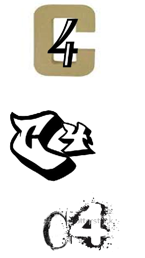
final Logo Justification.

i have chosen this logo to to be my final desgin for channel 4. i have chosen this to be my logo as i feel it is different and stands out to the viewers. this logo is mainly aimed at the younger generation. the style in which i have designed is more cartton like. catching the attention of children. i have added colour to my logo to make the 'c' and '4' bolder and stand out. also the colour in the background make the whole logo stand out. the what my logo is layed out gives the 'kiddy' impression. the way that the 'splat' is placed behind the main structure of the logo also gives the expression of a child painting.
Wednesday 2 October 2013
Monday 30 September 2013
9. Typography
 this font style is called kids written font.
why chosen. i have chosen this font as i feel it looks as though a 'kid' has written it.

why chosen: i have chosen this font because it looks up to date and very modern.

font name: cloister black.
why chosen: I feel this robot is old with the flicks and historic writing.

font style: one Direction
Why Chosen: I have chosen this font as it looks as though it has been done with a paintbrush. Thick, bold and hand written.

Font Style. exmouth.
why chosen: I have chosen this font as I fell it has a flow to it. It is upper class font showing the 'fashion' is high and expensive.
 font style: Fabrics
 Why chosen: I have chosen this font style as I feel it is different to others. it has the 'comedy' element. which its the lines going round the letters representing the stitching.
font style: nothing to loose.
 Why chosen: I have chosen this font as it is scary, meaning there's a lot of drama behind it. either being in a film or real life this font means lots of 'drama' has happened (bad things).
why chosen. i have chosen this font as i feel it fits this word best. it is thick and both with different flicks. making it aimed more at upper class people.
 Font style: Most wasted
Why chosen. i have chosen this style as it is graffiti like. it isn't bubble. however this style is how teenage people graffiti. it fits in with there age and how they act.

Font style. Lobster.
why chosen. i have chosen this font due to they way it is. it hasn't got any footballs or sport objects, however i feel it fits the was sport genre. it is written the same as a sports poster or they was written in a newpaper.
My Top 3 NME Music Videos
My Top Three Music Videos. NME.

Lady GaGa- Telephone. 17
This video was 9mins 31 seconds. This video had a small story had to it. there was many different camera filming to get the effect of the dancing and capture the different types of clothes and brands they was wearing. This video also had different photos of lady gaga with different costumes. this video is a main sex appeal for young middle ages people.

Fit But You Know it - 30
fit but you know it is a music video with a small story to it. it it recorded with low quality cameras, it is amunst the streets. it also has pictures that are played so it looks as though it is moving. this song is mainly rap. this song is for middle aged teenagers that look and watch what people do in everyday life.

The Scientist - Coldplay. 66.
This song is based on a story of a car crash. there's the main driver and two of her friends. the car crashes, then another crashes into them. the driver survives but her friends die. The song is played over the to of what is happening giving the mood and lyrics for what chaos has happened in the video. I feel this is a sad and upsetting video o as it can happen anywhere to anyone giving people a message.
Subscribe to:
Posts (Atom)