Monday 30 September 2013

9. Typography

this font style is called kids written font.
why chosen. i have chosen this font as i feel it looks as though a 'kid' has written it.


dront name: Golf wang.
why chosen: i have chosen this font because it looks up to date and very modern.


    font name: cloister black.
why chosen: I feel this robot is old with the flicks and historic writing.


font style: one Direction
Why Chosen: I have chosen this font as it looks as though it has been done with a paintbrush. Thick, bold and hand written.


   Font Style. exmouth.
                       why chosen: I have chosen this font as I fell it has a flow to it. It is upper class font showing the 'fashion'  is high and expensive.


   font style: Fabrics
                     Why chosen: I have chosen this font style as I feel it is different to others. it has the 'comedy' element. which its the lines going round the letters representing the stitching.


                                                                                  font style: nothing to loose.
                   Why chosen: I have chosen this font as it is scary, meaning there's a lot of drama behind it. either being in a film or real life this font means lots of 'drama' has happened (bad things).


Font Style.
why chosen. i have chosen this font as i feel it fits this word best. it is thick and both with different flicks. making it aimed more at upper class people.


Font style: Most wasted
Why chosen. i have chosen this style as it is graffiti like. it isn't bubble. however this style is how teenage people graffiti. it fits in with there age and how they act.


Font style. Lobster.
why chosen. i have chosen this font due to they way it is. it hasn't got any footballs or sport objects, however i feel it fits the was sport genre. it is written the same as a sports poster or they was written in a newpaper.

My Top 3 NME Music Videos

My Top Three Music Videos. NME.


Lady GaGa- Telephone. 17
This video was 9mins 31 seconds. This video had a small story had to it. there was many different camera filming to get the effect of the dancing and capture the different types of clothes and brands  they was wearing. This video also had different photos of lady gaga with different costumes. this video is a main sex appeal for young middle ages people.  


 Fit But You Know it - 30
fit but you know it is a music video with a small story to it. it it recorded with low quality cameras, it is amunst the streets. it also has pictures that are played so it looks as though it is moving. this song is mainly rap. this song is for middle aged teenagers that look and watch what people do in everyday life.


The Scientist - Coldplay. 66.
This song is based on a story of a car crash. there's the main driver and two of her friends. the car crashes, then another crashes into them. the driver survives but her friends die. The song is played over the to of what is happening giving the mood and lyrics for what chaos has happened in the video. I feel this is a sad and upsetting video o as it can happen anywhere to anyone giving people a message.

Monday 23 September 2013

13. Ident Analysis


logo Designs


Logo Designs


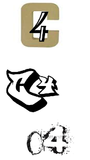
10. Logo designs


music Genres

Indie:
wihtin inie music i have notices various things.The artist or band are usually shown throughout the music video. The use of extreme close ups in the music videos were very popular. There was filming in a lot of dark locations and there was some use of special effects in the music videos. indie music has a small story. a single camera. it is normally dark and festival like. The term indie rock, which comes from "independent," describes the small and relatively low-budget Labels on which it is released and the do-it-yourself attitude of the bands and artists involved. 


Within the music video Feel Good inc, it is mainly animated however half way through the video they have different clips of the actual artist with the animated character just in front, each animated character represents one of the artists. The lyrics fit in within the what is being animated, e.g: 'windmill windmill' and animated windmill fly's across the screen.


Hip Hop:
within all Hip hop music they all involve either: money, cars, jewellery, drugs and lots of women. within these hip hop music videos the artist is the main centre of attention attention. There are many different camera angles involving the artist however there are mainly close up of the artist. this is demonstrating that it it is their song. they use multi cameras to catch the artist in different ways. Also looking at various different hip hoop music videos there isn't a main storyline.  
Dr Dre- Kush 
this music video fits in very well within the hip hop genre. This is a rap song however throughout the video there are many different aspects that fit in with this genre. there are many close up of the artists and clips of girls dancing money flying, flash expensive cars and drugs. Dr Dre is wearing various different jewellery implying he is rich but also a 'gangster'  not many other people are wearing jewellery so this implies that Dr Dre is the main artist and is the centre of attention. 


Pop:
 I have looked at many different types of 'pop' music videos. they are mainly very bright and colourful. there are many close up of the art its singing due to either emotion of to show the viewer the 'beauty'. The videos are aimed towards the teenage audience and are very up beat. Even though within pop videos there are bands they are different  to indie and rock. this is due to in pop music videos, the 'group' don't play and instruments. they do q lot of dancing with bright colours being very up beat. 


One Direction- what makes you beautiful. 
i feel this is a very good pop video with 'boy band' one direction are very upbeat, the song they are signing has been written for them, however as they are very young and 'attractive', there are many close up of individual faces. they dance with girls and dance all in sync.  it is very bright and colourful attractive a younger target audience. 


Rock: 
within Rock music videos there is a lot of key things that i have noticed that make them unique from other music convention music videos. I have noticed that the music videos always show the main singer in the video. Rock music videos always show and tell a story. the band that are playing are always playing different instruments and are more like a 'band' this shows that the art its are very skilled and are good performers. also after seeing rock music videos i have notice that the lighting are very low and dark making its gloomy.
queues of the stone age.


Wednesday 11 September 2013

2.Corporate Identity Theory

Corporate Identity Page.

In this essay I will explain and analyze the corporate identity theory of channel 4. I will explain the three different areas of corporate identity theory.  These are corporate design, corporate communication and corporate behavior.  These three different areas have their own aspects and meaning to the whole corporate identity theory such as the logo the colors they use, there advertising, internal values and ethos.

Corporate Identity is simply the way in which the public view a business/cooperation/firm, in terms of media, it may be how the public previewed the media firms. It is vital that all media firms all have a cooperate identity for various reasons. Such as for them to answer questions such as 'who are we' (as a company). It’s also essential for the companies to meet their set objectives and for the consumers to have a sense of belonging to the company, as the company has created an identity in order to gain a specific target market. They brand their company/project/film in order for it to be well received by the desired consumer, this is done with the extensive research and planning from the firm which have created a 'persona'. The media continues to have a huge impact on the corporate identity by reinforcing a certain 'representation' or 'image'

For the begging of my essay I will be explaining the corporate design for channel 4. Their main logo is designed and made up of different land scape to create the number '4'. They use many famous places such as Tokyo, so that people would recognize and show them how large and well known there corporation is. Their main logo is just black and white making it stand out and attracting viewers of all ages, however they use the construction and colors of the landscape and place them in the shape of the number 4 to show their creative side and how they are different. This is very different to other corporations, making it unique and exciting for the viewer.


  (Google images) these pictures show and demonstrate their logo and how the develop it on into their idents. The pic on the right is there ident from Tokyo. I feel that their main logo is string. It stands out due to the black and white effect. I also feel that the shapes they use mix and connect nicely with their ident images, making them connect and fit together, showing us the viewers it well thought out and clever.

For this paragraph  I am going to talk about the corporate communication of Channel 4 which consist of how they advertise and how they communicate and their relation to the public. Channel 4 have different ways to show who they are. They have many different types of idents which are a small clip with their land scape images of the number '4'. In these short clips they occasionally explain and tell the viewer a little bit of information about the next program that is about to be shown. Channel 4 also do their own news channel showing they know what is happening around the world and get involved. They inform people the different programs they show while advertising there corporation. Channel 4 also have brakes In between there programs and during, this is due to the advertising off different brands and organizations and also bring channel 4 more money to pay for the uses and make there corporation brighter and bigger than others. "You can now watch Peep Show on your mobile, Countdown on your laptop and even, should you wish, Channel 4 News on your XBOX"(4 viewers) this shows that channel 4 are wanting to become bigger, keeping up with the latest technology, understanding how people work and what they do. I feel that this as a good idea many corporations are developing every day, making it hard to keep up to date with the market place, money is always an issue but channel 4 is always keeping up and is amongst the big names of television.

For my second to last paragraph I'm going to talk about the corporate behavior on who they are and what they want to achieve.  Channel 4 want to be one of the most well-known corporation. They want to be bigger than everyone else. "It began to focus on the edges of the mainstream, and the center of the mass market itself" (Wikipedia) they started looking into things looking at ways to develop become bigger, they wanted to make sure they had what they needed to have to compete in the market place. I feel research is important in television as it has a lot of hard and challenging competition throughout the world. Without the research and development then they will be basic and boring. Channel 4 are different and well known for their idents. This catches the viewers’ attention of all ages and gives a better view on what they are all about. Channel 4 are a corporation for people of all ages. The show many different ranges of program's for children and the elderly. They have now got a '4 news channel' which also catches the attention of anyone of the ages of 12+.


 From analyzing all the different aspects of corporate identity theory for channel 4. I fell that channel 4 has developed very well over time and is in the right market place to compete with large corporations. Channel 4 has its own things that make it unique and stand out. They have used technology to develop and make it easier for viewer to use. They have a strong logo which stands out and strong idents that amuse many consumers.


https://www.google.co.uk/search?q=channel%3B+4&source=lnms&tbm=isch&sa=X&ei=-RcuUsHpBeHF7Abyi4DQDA&ved=0CAcQ_AUoAQ&biw=1821&bih=795#facrc=_&imgdii=_&imgrc=3_TkDYoDrhEe6M%3A%3BXJKbQ9FuPkYp-M%3Bhttp%253A%252F%252Fwww.ukfree.tv%252Fstyles%252Fimages%252F2009_channel%252FC4.jpg%3Bhttp%253A%252F%252Fwww.ukfree.tv%252Fshowchannel.php%253Fid%253DC4%3B606%3B337

https://www.google.co.uk/search?q=channel%3B+4&source=lnms&tbm=isch&sa=X&ei=-RcuUsHpBeHF7Abyi4DQDA&ved=0CAcQ_AUoAQ&biw=1821&bih=795#facrc=_&imgdii=_&imgrc=SF_vtRQMJF2WuM%3A%3BMqwllGY6ZFIUUM%3Bhttp%253A%252F%252Fwww.thedrum.com%252Fuploads%252Fdrum_basic_article%252F86874%252Fmain_images%252Fchannel-4-logo.jpg%3Bhttp%253A%252F%252Fwww.thedrum.com%252Fnews%252F2012%252F02%252F13%252Fheart-magazines-group-commercial-director-salmon-join-channel-4-head-agency-sales%3B650%3B488

http://www.channel4.com/4viewers/viewer-promise

http://www.ask.com/wiki/Channel_4?o=2802&qsrc=999&ad=doubleDown&an=apn&ap=ask.com

Tuesday 10 September 2013

1. History of bbc idents.

History Of Idents For BBC.


Though the BBC was created in 1922, a formal BBC brand did not evolve until fairly late in the corporation's history. Initially, a mix of straight type or decorative design motifs were used – see for example the elaborate tracery of the initials found on the mosaic floor of the original reception of Broadcasting House (opened 1932).

Bat's wings logo


This logo would appear before such programmes as Quartermass II.

The first attempt at a proper brand image came in 1953, when Abram Games was commissioned to design an on-air image, probably hastened by the imminent arrival of commercial competition. Games, who designed the logo for the Festival of Britain in 1951, created the logo nicknamed the 'Bat's wings' logo, an elegant and rather ethereal image which captured the spirit of the times. In reality, it was an elaborate mechanical brass contraption, with a tiny spinning globe in its centre – for BBC Scotland, the spot in the middle was replaced by a lion.


BBC1 globeBy the early 1960s, the 'Bat's Wings had been superseded by the BBC TV logo within a circle, behind which would appear a map of Britain split into broadcast regions. This set the style for a succession of circular images, which became the BBC's recognisable on screen identity.


The channel's most famous emblem, the globe, appeared in its first guise on 30 September 1963. The first such ident featured the continuity announcer speaking the words 'This is BBC Television' over a spinning globe while a BBC TV caption would appear.

BBC2 stripes
A big publicity campaign was mounted to launch the new channel, using the rather playful symbol of a kangaroo with a baby in its pouch, with the even more unlikely names of Hullabaloo and Custard (visuals drawn by artist Desmond Marwood). The evening of the launch was famously marred by a power failure in West London, and at one point candles even appeared on the screen.


BBC mirror globeThe first colour pictures in the UK were broadcast by BBC2 in 1967 when it covered Wimbledon, to be followed by BBC1 in 1969. Then BBC 1 introduced the first version of the now famous 'mirror globe' – a rotating globe with a flat globe as visual behind it. The inclusion of the word 'colour' in the station ident could be
viewed as a subtle reminder to the vast majority of the rest of the viewers still watching in black and white to buy a colour TV set. This BBC 1 colour globe was frequently seen in Monty Python's Flying Circus, which featured spoof continuity announcements.

in the 1980s, the futuristic stripy lettering was introduced for BBC 2 (designer, Oliver Elmes). In terms of its manufacture, this was a major departure – in that it did not use a model nor did it exist on film. Instead, the symbol was played out from a solid state device, which could produce both a static image and a moving
BBC 2
sequence. The BBC 2 logo animation lasted four seconds, and showed both logo and stripes appearing and then magically disappearing.  This logo was seen in spoof continuity announcements in series such as Not the 9 o'clock News and The Young Ones.


BBC angled logo 1988In 1988, mainly because of growing commercial competition, the BBC decided it needed a stronger, more unified corporate brand image – to be used on and off air, and across all its commercial product. The new image (designer, Michael Peters) looked back to the traditional BBC logo but updated it by slanting the boxes and adding three coloured flashes unbderneath the logo blocks. The latter colours represented the phosphors on a colour television (the primary colours of light).

Later in the 1990s, the BBC decided a revision of the wider corporate identity was needed, as the current slanting logo did not work very effectively on screen – so the sides were straightened from their idisyncratic 17.5 degree slant, the colour flashes were removed, and the typeface was rendered into Gill Sans.


 change in BBC One Controller saw the BBC One balloon image replaced by a sequence of new idents, 'Rhythm & Movement', featuring a new multi-cultural theme, with a range of dancers dancing to different musical styles. Some viewers

accused the BBC of being overtly politically correct, as one of the dance numbers involved disabled dancers in wheelchairs, while other users were dismayed that the longstanding globe motif had been abandoned after 39 years.


logos_blocks.jpg


Rhythm and MovementAfter six years, the idents were replaced by a new circular motif, with content much more diverse than previously seen: swimming hippos, motorbike stunt riders, kites, and surfers. Launched in 2007, the then BBC One Channel Controller, Peter Fincham saw the new branding as both a clear recognition of the BBC brand story and of the channel's heritage as well as a new symbol of people coming together – in the way that BBC One brings audiences together.


Click for larger image

Majestically launching the circle theme at 9:58am on Saturday 07 October, a group of stunt kite flyers arrange their kites into a circular formation. Filmed on Ynyslas beach in North Wales, and featuring members of the Turbulence group of extreme kite flyers.


Click for larger image


Thursday 5 September 2013


file://localhost/Volumes/StudentHome/41228/Channel%20Logo%20Analysis.docx