Monday 21 October 2013

Cinematography

180 degree rule


Busted Year 3000
In film making, the 180-degree rule is a basic guideline regarding the on-screen spatial relationship between a character and another character or object within a scene. An imaginary line called the axisconnects the characters, and by keeping the camera on one side of this axis for every shot in the scene, the first character is always frame right of the second character, who is then always frame left of the first. The camera passing over the axis is called jumping the line or crossing the line; breaking the 180-degree rule by shooting on all sides is known as shooting in the round.


The 180 degree rule is where there is a camera that only turns 180 degrees. This camera can only see what is in front of the camera. Whatever is behinds cannot be seen, this can be useful due to the camera crew sound crew and other roles are behind the camera. these can all do their jobs normally close to the where the scene is being based and not worry about getting in the way of the camera. the camera moves and can only see what is in front from a 180 degree angle.


Rule Of Thirds

In the rule of thirds, photos are divided into thirds with two imaginary lines vertically and two lines horizontally making three columns, three rows, and nine sections in the images. Important compositional elements and leading lines are placed on or near the imaginary lines and where the lines intersect.

However there is another method, 'rule of thirds' this is very good and useful for getting two different faces on one screen. one of the actors face is on one side on the screen, they pull the facial expression as if the person they are talking to is next to them, however on another camera the face of the other person is on the opposite side of the screen and they do the same expression.


finished Logo Designs


Saturday 19 October 2013

single camera Analysis

Single Camera Analysis.

 
Many different TV programs music's videos are all recorded by a single camera, this is due to many different things such as it being cheaper. also this methods id used because It makes it easier to focus on a main point. having a single camera makes it easier to record there's only one point of view that is seen. This is a simple and basic way of using a camera, however it is very effective and quick.


friends has a single camera. I feel that is used very effectively, the camera is aimed on the actors speaking, as this is more of a 'comedy' program its gives the lines the actors say and the way they act more effect as the camera isn't moving and changing views making it difficult and hard to follow/understand.

Friday 18 October 2013

Music Video recipe


This music video was released in 1986. It is called 'Bananarama' by venus. The music video was mainly of the artist, but dressed to the style of the 80's. the camera also sometimes went off the and did other mini clips of dark deathly things. this expresses what the lyrics are about and the personality of the artist and the song.  it exploded with flames and dancing, this is because there wasn't many special effects so they had to doing it first hand. Giving the video more impact and making it more exciting.


This music video was created in 1997. This is called 'Virtual Insanity' sung by Jamiroquai. The music video had one main camera. That occassinaly pointed up and down. Giving the video more effect and able to change the scene clevery and efficiently. The video was mainly based in a small white room with the main artist singing and dancing in dark clothes so he stood out. The white room  makes the artist look rich and big, white is a bright colour, with the main artist in in dark clothes bring him out making him bold. showing he's the main character, everybody should be looking at him.


Blink-182 created 'All The Small Things' music video in 2000. The video was based in several different places, going from scene to scene the group did something different. They danced and played there instruments to show the talent they had. The camera gave the video more effect and it moved around in the flow. This music video zoomed in and out to give it more effect, it shows the close up of the faces as well as the zoomed out camera shots. This is to exaggerate what they are wearing and also how they dance and move.


if the music and zoomed in and out. WHY??


'Dog days are over'  music video was created on the1st of December 2008 but Florence + The Machine. the video was different but you could tell and understand the story. There was backing dancers dressed in bright clown costumes, where as Florence was dressed in a long black dress so once again she stood out. there was many different camera around so it gave the video more effect. Making it more exciting to watch. there wasn't any instruments in this video but you could clearly see Florence singing.


Many things are found in various different music genres. many videos have lots of dancing. Many videos have different lighting to get different effects for the different type of song. The clothes varies to what genera it is. However Female artists give a lot of sex appeal, the attract men to watch there video from their dancers and what they are wearing.
GRADING

Working towards a Pass
The next step is to be more detailed in the way that you use your examples. Be specific.

Sunday 6 October 2013

8.channel logo analysis

E4 logo:
This is the e4 logo there colour scheme is purple. this colour stand out to theirs its not to feminine and not to masculine, they have always used this colour. they have also combined the 'e' into the '4' this gives the logo more imaginative look, makes it more exciting for the viewers. I feel this logo is designed well as you can clearly see what it is and also catches your attention.
Target audience: i feel that this logo is aimed at a target audience of 12-28 year old. i have come to this conclusion due to the colour E4 have chosen and also the rounded shape can be a younger target audience however the sharpness of the 'E' is more aimed at a older age.


Channel 4 logo:


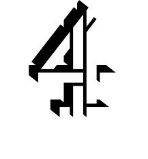
 The channel 4 logo doesn't have a colour scheme, other the years they have changed the colour of their logo. however the way the different shapes form the number '4' makes this logo very different.its confusing but very clever. also this logo stands out you can clearly see what it is.
Target audience: I have decided that the target audience is aimed at a more older generation. people from around 25-40 years of age i have chosen this target audience as there isn't  a colour scheme and the shapes used can be quiet interesting.


BBC One logo:

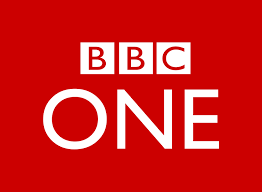
 The BBC One logo normally has a red background and a white font. this is a very  good and clever technique the red is bright and vibrant. it stands put. the white however also is very clear on a red surface. the 'bbc' Is in blocks this makes it stand out more. the 'one' is also larger than the 'bbc' but isn't in blocks. this is clever because as it is bigger you see it more. but a the 'bbc' is In blocks it catches the attention of the viewer more.
Target Audience: Having looked at BBC 1 logo i have decided that there logo is aimed at a older age group this is due to the fact in font choice and how it is positioned in the middle of a square red background.

ITV logo:
The ITV logo can have different colour schemes depending on the channel. however their main logo has various different colours. It had a bright vibrant blue that grabs the viewers attention, then the lighter blue draws the viewer across. the black give the logo more of a definition. i find it interesting how it is all lower case, however if it was in capitals then it couldn't be joined up as easy.
Target Audience: i feel that this ITV logo is aimed at all ages, the colours can catch the attention of older people and younger. also the way the font has been chosen will connect with a younger generation as it is lowercase and joined together.


SKY 1 logo:
The SKY 1 logo has a very simple layout. You can clearly see the logo on the left hand side and then the vibrant blue behind the one stands out the most. this is in the middle of the logo and then the viewer rears off to the left which will then be easily noticed as SKY 1.
Target Audience: I feel that this target audience is aimed at higher age. this is due  to the colours that are chosen and also the format in which this logo is laid out. it is very bold and clear however there are simple shapes.


Thursday 3 October 2013

final Logo Justification.


 i have chosen this logo to to be my final desgin for channel 4. i have chosen this to be my logo as i feel it is different and stands out to the viewers. this logo is mainly aimed at the younger generation. the style in which i have designed is more cartton like. catching the attention of children. i have added colour to my logo to make the 'c' and '4' bolder and stand out. also the colour in the background make the whole logo stand out. the what my logo is layed out gives the 'kiddy' impression. the way that the 'splat' is placed behind the main structure of the logo also gives the expression of a child painting.

Design and Purpose

http://www.slideshare.net/kbag69/pp-1-26819398